SuperStock UX & UI
UX & UI Consult: Audit → Strategic redesign → UI implementation
Skills Used: UX design, Visual Design, Team Management, Art Direction, UAT, Development, Automation


The Background
SuperStock is a rich asset-library platform (photography, illustration, footage) offering search, browsing, licensing and subscription models. When I began work, the platform had a longstanding site (captured via the Wayback Machine) where the branding, UX patterns and information architecture had become dated.
Major pain-points included:
Heavy cognitive load on the homepage: such as a somewhat confusing navigation hierarchy.
Branding and UI inconsistencies: the site lacked a clear tertiary brand colour or system to differentiate action-items versus passive content.
Accessibility and performance bottlenecks: contrast of UI elements varied, the site was not optimised for screen readers or keyboard navigation.
SEO & content strategy gaps: the homepage and key landing pages were relatively thin on long-form, topic-expert content.
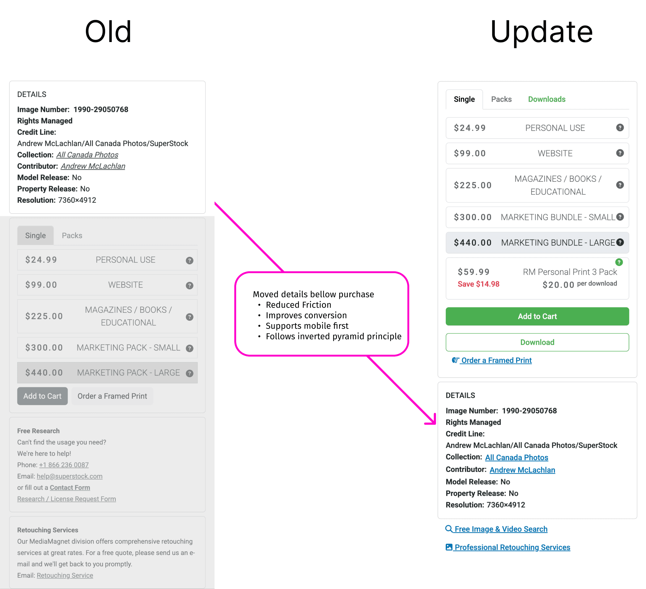
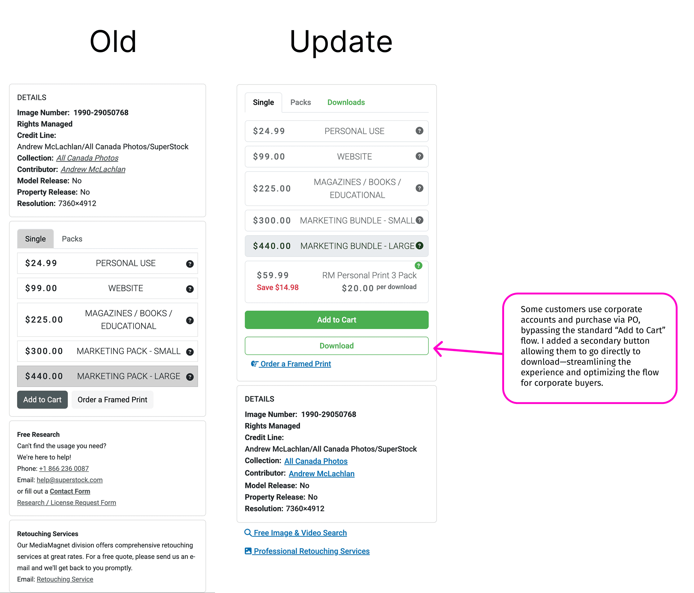
User-flow obstacles: For licensing customers or contributors, the path to search, select, license and purchase felt less streamlined than modern SaaS/licensing platforms.
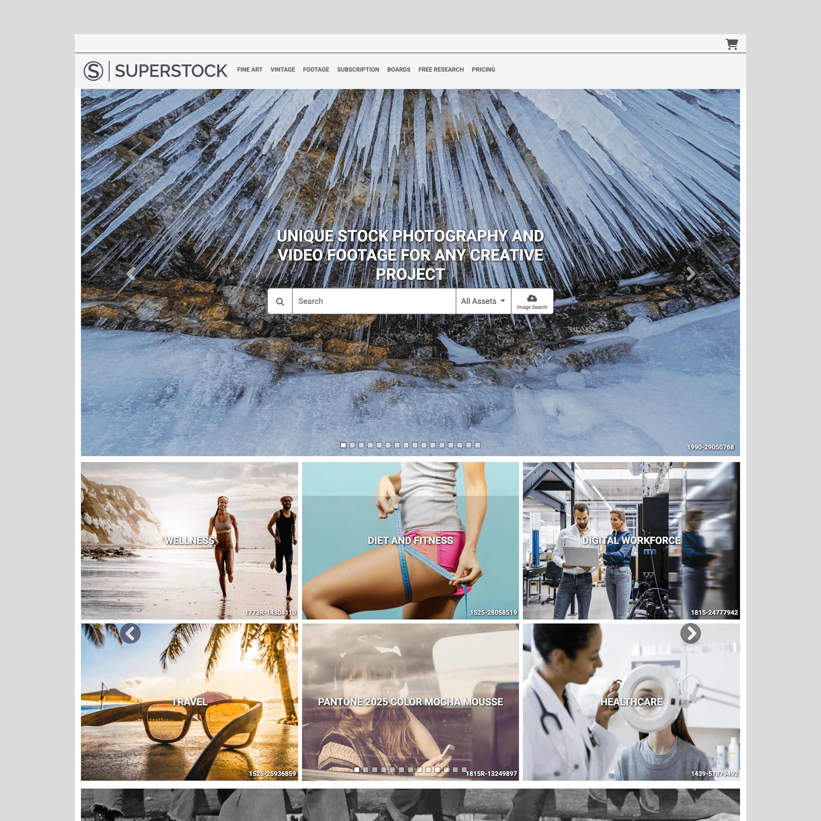
Before
The site when starting my audit

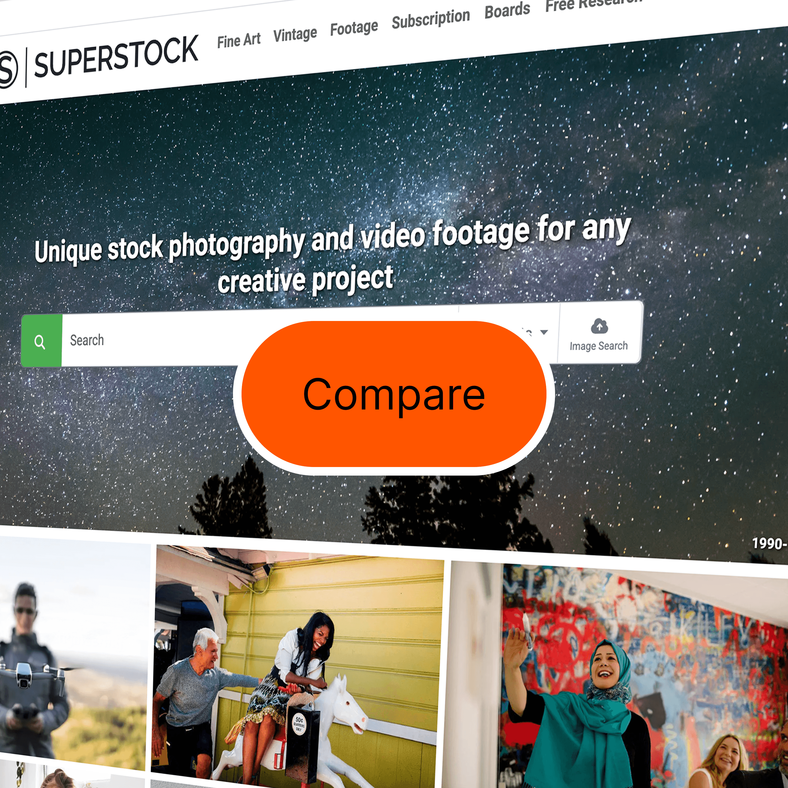
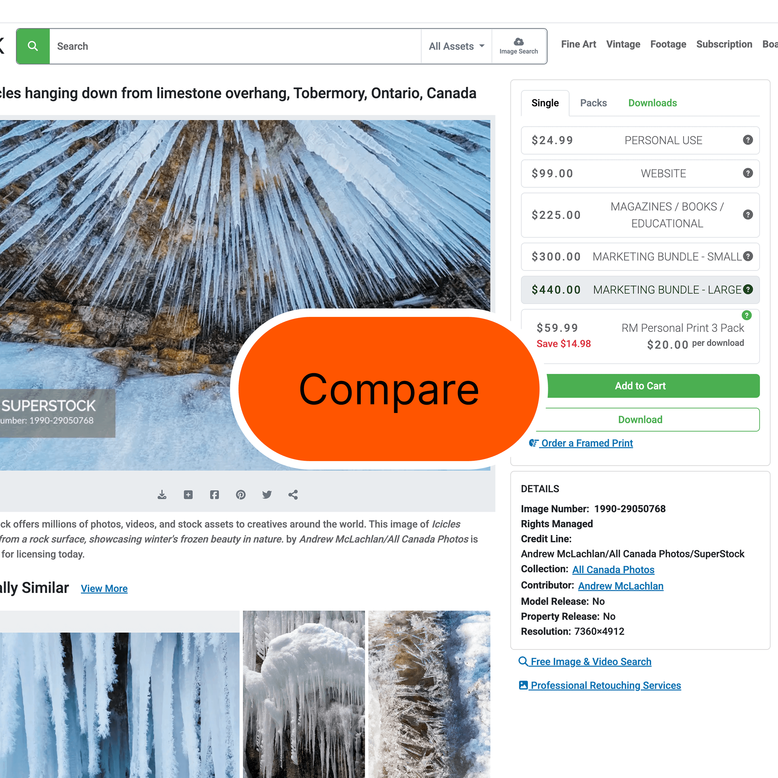
After
The site as it appears today with my callouts
Audit & Competitive Review
Audit of original site
The homepage lacked visual hierarchy, with all sections—galleries, blog posts, and services like Print-on-Demand—presented as identical image tiles with text overlays. This made it difficult for users to distinguish content types or understand priorities at a glance.
The page was not easily scannable. It offered no long-form or authoritative content to establish expertise or guide the user journey, resulting in weak SEO value and low engagement depth.
The excessive use of all-caps typography created a sense of visual noise, conveying an unintentionally aggressive tone. As a result, it reinforced the UX principle that when everything is emphasized, nothing truly stands out.
The design missed opportunities for social proof, lacking visible callouts or logo placements for notable clients such as BBDO or Microsoft—key credibility drivers for enterprise and agency audiences.
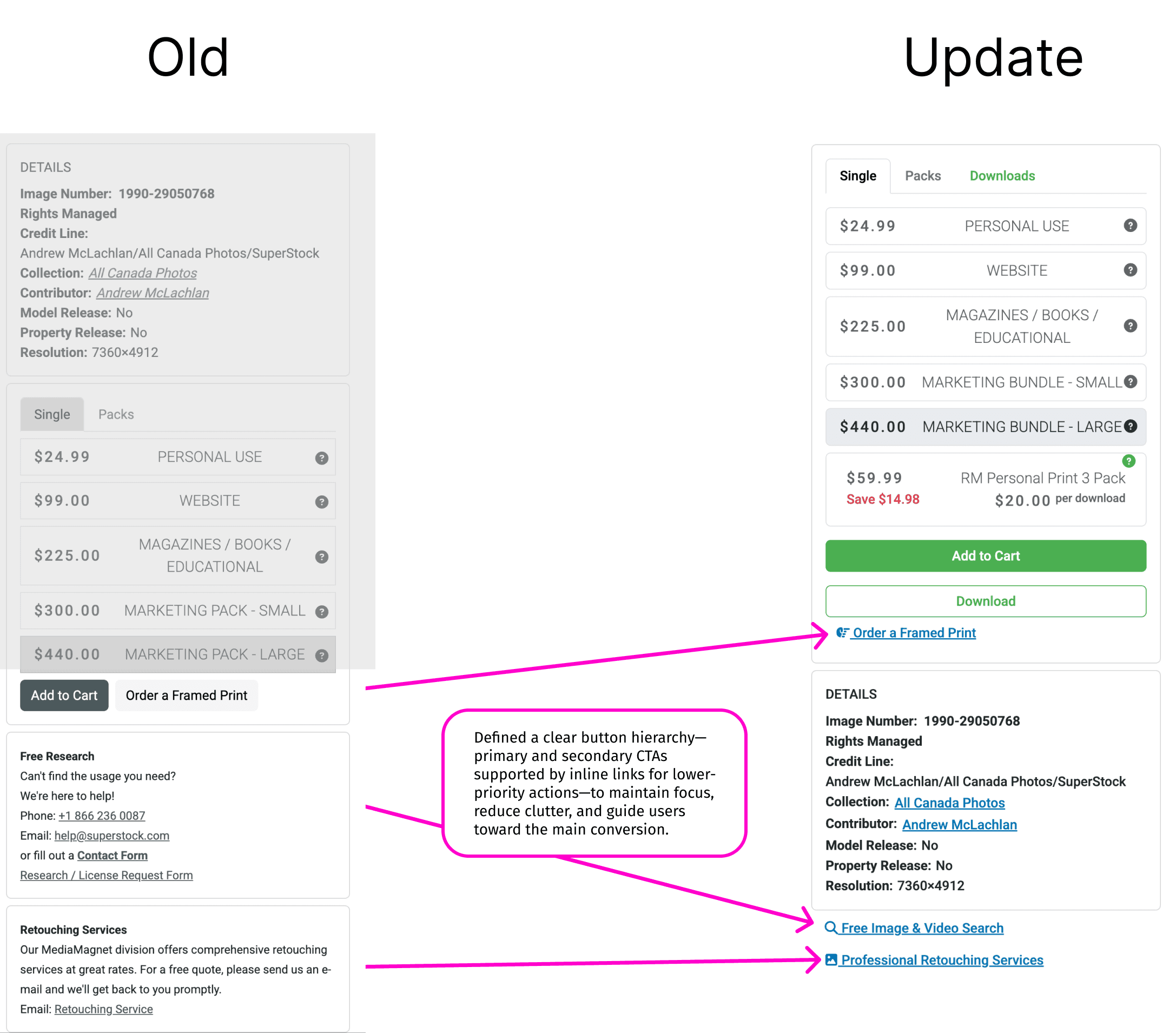
The UI treatment was inconsistent and low-contrast, relying heavily on grayscale buttons and action states, which undermined accessibility, clarity, and intuitive navigation.
Competitive review
I benchmarked 3–4 peer/licensing platforms (e.g., competitors offering stock imagery/footage) to identify best practices:
Clear, single CTA above the fold (“Search assets now”, “Browse collection”)
Use of tertiary accent colors for action-buttons (to differentiate primary vs secondary actions)
Structured long-form content on home or landing pages to establish authority (e.g., “How to pick stock footage for your campaign”, “Licensing explained” )
Accessibility features built-in (keyboard focus states, high contrast UI, adjustable alt text)
Streamlined user-flows from homepage → search results → license purchase, with minimal distractions or modal overloads.
Updates
The homepage now clearly differentiates content types: the revamped Services area is visually distinct from content tiles (blog, galleries) and features teaser copy plus direct links, enabling scalable expansion of service offerings.
Navigation and user flows have been simplified and streamlined, guiding users from awareness to action with reduced friction and cognitive load.
The design system now incorporates a defined tertiary accent (green) for primary actions, which enhances brand recognition and provides a consistent visual cue for actionable items across the site.
ADA-compliance and readability have been elevated: accessible contrast ratios, proper semantic headings, descriptive alt text, and keyboard-friendly interactions create a more inclusive experience.
The UI has been modernised with a cleaner layout, simplified color palette, and clearer typography—resulting in a faster-loading, visually ordered, and intuitive site that drives higher engagement and SEO performance.
Mixed case vs. All caps
Headers and menus are now upper lower
• All caps flattens shape recognition
• All caps gives impression of shouting
• All caps also feel rigid and cold.
• more scannable and friendlier feel
Introduced a brand green
Replaced the grey cta's with #4CAF50
• Association with positivity
- Trust and reassurance.
• Natural vibe
- conveys wellness
• High-viz without aggression
•. Universally means GO
•. Works well with neutral palettes
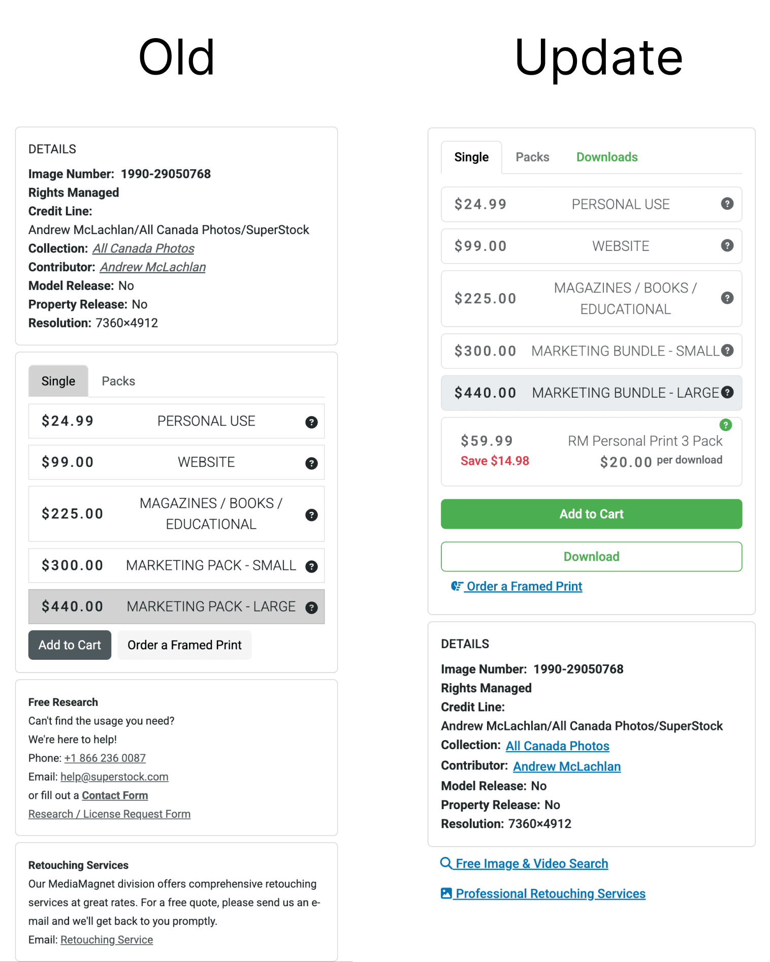
Key UX/UI Outcomes
Brand Color System
Introduced a tertiary green accent to clearly define CTAs and actionable elements.
Retained core blue/grey palette for brand continuity while improving visual hierarchy and consistency.
Homepage Redesign
Clear type and visual hierarchy
Added brand partners for improved SEO
Differentiated visuals for products to cut down on confusion
UI Enhancements
Established consistent button hierarchy and hover/focus states.
Improved typography, contrast, and accessibility to meet WCAG AA standards.
Simplified navigation and optimized site performance (lazy loading, asset compression).
Implemented A/B testing to validate color and CTA performance.
Flow & Cognitive Load Improvements
Clearer action markers reduce decision friction and highlight next steps.
Removed distracting elements like the hero slider for faster orientation.
Structured content hierarchy (hero → info → categories → proof points) improves scannability and comprehension.
Simplified layouts and increased whitespace enhance readability and focus.