Financial Platform UX Re-Architecture
Product UX & Experience Lead — Strategy + Interface Direction
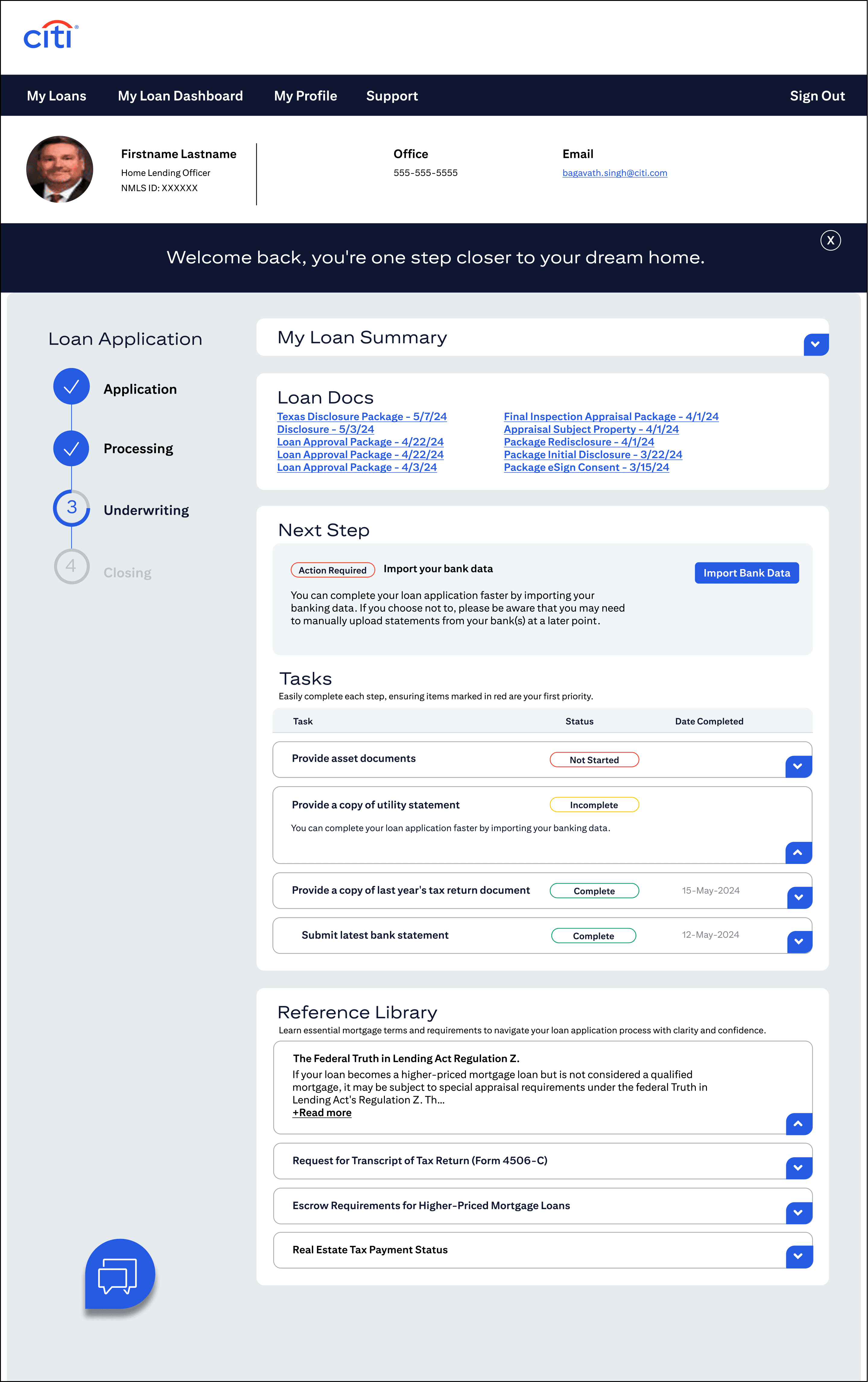
Citi’s loan dashboard served users navigating complex financial processes with high cognitive load and fragmented navigation. The experience demanded clarity, hierarchy, and decision support — not just visual polish. As the UX and experience lead, I partnered with product, engineering, and analytics teams to simplify the interface and elevate the dashboard into a more intuitive, user-focused financial tool.

The Challenge
The core dashboard experience was bogged down by:
• Fragmented navigation across loan types
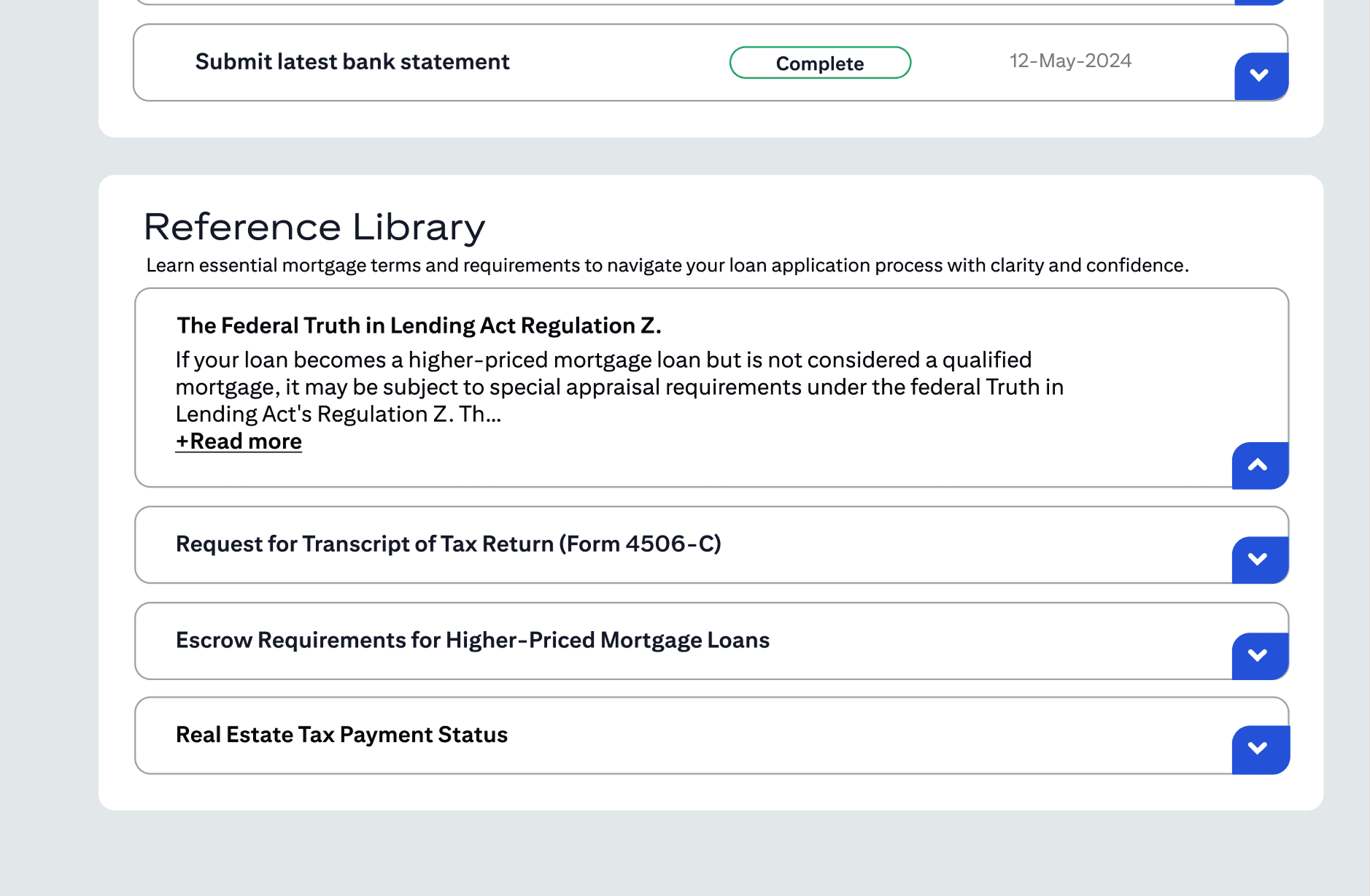
• Unnecessary tabs and modals that disrupted task flow
• Confusing document review processes
• Redundant steps that increased cognitive load
These issues led to user frustration and incomplete conversions. My mandate was to unify the experience, streamline task flows, and make high-stakes financial decisions feel clear and supported.

Strategic Approach
Rather than simply redesigning screens, I led a structured research-informed experience strategy focused on:
• Usability validation and task flow analysis
• Competitive benchmarking of top financial platforms
• Collaborative synthesis with product and engineering
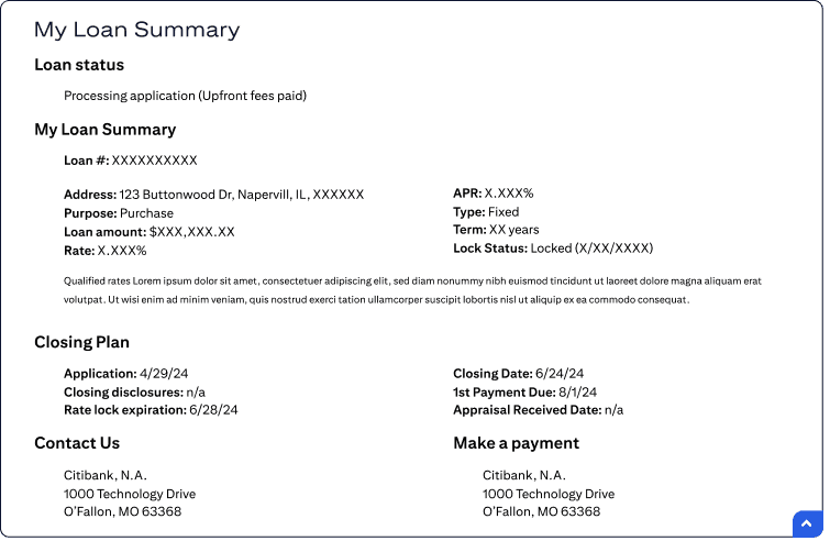
• Information hierarchy restructuring
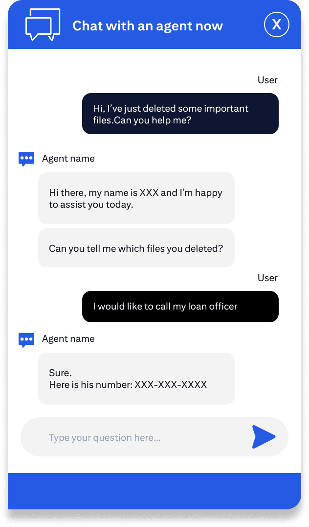
• Interaction consistency and feedback loop design
This ensured our changes were grounded in user insight, enterprise context, and business priorities.


Creative Solution
The redesigned experience centered on:
Clear task pathways: Simplified progression from entry to loan decision completion
Streamlined navigation: Reduced cognitive load by collapsing redundant navigation layers
Instructional clarity: Improved information labeling and guidance cues
Visual hierarchy: Stronger visual systems to clarify priority vs. supporting content
Consistency across states: Predictable interaction patterns from initiation through completion
Each design decision was tied back to both user experience goals and business outcomes.


Impact
The redesigned dashboard achieved:
Improved clarity of core workflows — Users moved more confidently through high-stakes tasks
Reduced navigation friction — Simplified pathways decreased user cognitive effort
Stronger alignment between UX and business goals — Design decisions supported conversion and task efficiency
Cross-functional buy-in — Product and engineering were aligned on key priorities and execution
This UX strategy reframed the dashboard not as a collection of screens, but as a cohesive financial journey — merging user needs with enterprise rigor.
TL;DR
• Led UX strategy and experience direction for complex financial workflows
• Re-architected navigation and interaction patterns
• Aligned product and design decisions with measurable outcomes